Before enrolling in the Public Relations in Style and Design course at Auburn University, I had no experience using Adobe Creative Cloud services. For this specific course, we started off with Indesign, Illustrator, Photoshop, and Lightroom. At first, the programs intimidated me. However, after completing the Adobe Creative Cloud tutorials, which I highly recommend for anyone starting a digital design journey, I learned that with practice the programs are a great way to express creativity and can even be fun to use. My favorite program to use for class and now on my own time as well, is Photoshop.
The term “photoshop” is often associated with altering images in a deceiving way especially on social media. Yes, you can fix a blemish, curve in your waste, or rid a fly-away hair from your face on Photoshop, but as a public relations practitioner, I learned that images can be created, altered, and enhanced for branding or basic design creativity.
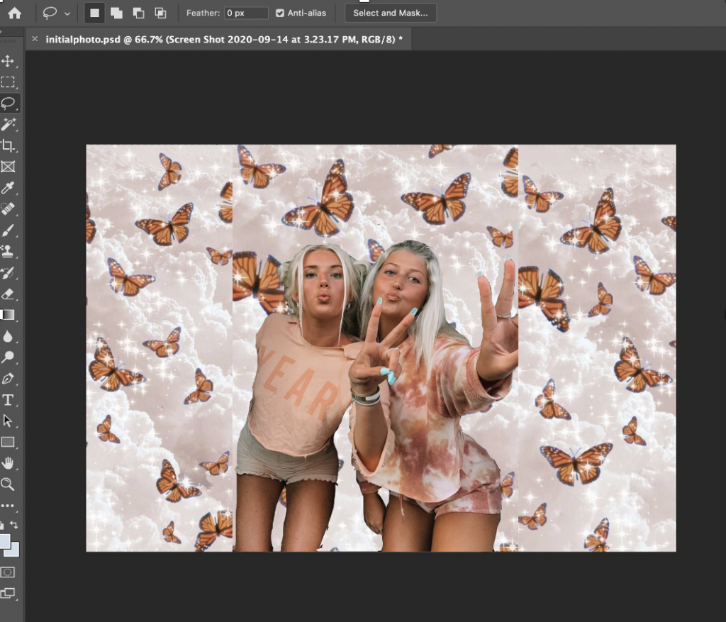
As I was getting acquainted with Photoshop, a friend of mine was talking about wanting a graphic behind a photo of her and a friend to possibly share on Instagram. I realized this was the perfect time for me to practice some of my skills. Pictured below, is the image I created. I first started by finding a background on Pinterest that she liked and matched their orange outfits. I inserted the graphic then placed the same graphic twice more around the initial one so the pattern would continue throughout the page. Next, it was time for me to use the layer tool and create a second layer with the photo of my friends on top. I then used the magic wand tool to rid the majority of the background before going in with the lasso tool to carefully cut out the rest. While this design is far from perfect, it taught me how fun Photoshop can be, and that I can create anything I want.

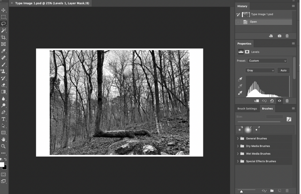
Moving along in my Photoshop journey, the first piece I created for class, was a typography assignment where I was required to find a letter form in nature and set a type letterform next to it. I was thrilled when I found a clear “L” shape of a tree. I was even more thrilled that using Adobe Fonts, I was able to download the perfect font to match my nature letter form. The font families function allows you to search through a plethora of fonts and their variations and download them to any of the cloud programs. While the image is set in black in white, I wanted my letter form from nature to stand out a little more I was able to change the grayscale. I eventually imported this image in Indesign to set it next to my letterform, however I found that using Photoshop to enhance and edit my image was easiest.

My journey with Photoshop is still ongoing, and I know it takes a lot of practice to perfect the use of the program. But familiarizing myself with the tools and having the patience to learn is what has set me up for success so far. As someone who started with no previous experience, I encourage anyone wanting to explore design to start with Photoshop, take their time, and use resources like the Adobe Creative Cloud tutorials or Envato Tuts+ Youtube tutorials to help them get on the ground and running!